
Technical Tuesday No. 1: Why CMYK?
![]()
Are you fed up with the colours of your finished print looking different to how it looks on screen when you design it? Do you know the difference between CMYK and RGB?
TRY THIS!
Download and print this PDF on your colour printer

and compare the printed colours on paper to the colours you see on your screen.
Notice how the RGB (Red, Green & Blue) colours in the top row are luminous and vibrant on screen but less vibrant when printed.

This is because standard screens and monitors produce colours in RGB and are not colour callibrated, but all printers print in industry standard CMYK, Cyan, Magenta, Yellow
& Key (Black).
For us to print your RGB artwork we will have to convert it to CMYK for you, the effect of this you can see here. The colours have changed, but now look similar on screen to on paper.

The colour blocks in the bottom row are originally created in CMYK. You should find that the printed colours are a close match to those on screen.

To avoid a colour shift make sure you create your artwork in CMYK.
Read on for the detailed guide, how to create your artwork in CMYK and for reasons why your colours may still not look quite as bright as on screen.
What is CMYK?
CMYK stands for Cyan, Magenta, Yellow and Key (Black), the 4 different inks used by print suppliers to print your artwork and most desktop colour printers.
You can make up the standard colour spectrum or ‘gamut’ available to printers using these 4 colours, similar to the way your computer monitor or TV makes up the colour on your screen using the RGB (Red Green and Blue) pixel mix to make all the colours you see.
Do RGB and CMYK colours look the same?
No. Although you would imagine that the same colour range can be produced, these two colour spectrums can look very different when viewed on a computer screen when you are checking your proofs. The diagram below shows the differerences in the range of colours available in the visible, RGB & CMYK spectrums. There are far fewer colours availabe for reproduction by the CMYK printing process.
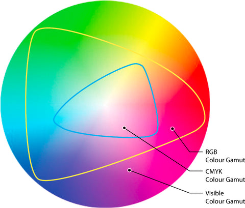
Diagram: myworldofcolour
Although basic desktop publishing software (such as Word and Publisher) will allow the use of luminous shades of green, pink, cyan and blue, it is IMPOSSIBLE to reproduce these colours in the 4 colour printing process.
How can colour issues be avoided?
The best way is to use a commercial design program like Adobe InDesign, Photoshop, Quark etc. or a good free program such as Scribus, which allow the creation of print-ready artwork in CMYK.
I don’t have access to those, programmes I only have Word. How will you help me see what my printed leaflet will look like?
If you supply artwork to us in RGB format, we will convert it to CMYK so that the proof we send you is as closely matched to your finished print as possible. This way there will be no surprises for you or us!
Why do the colours still look ‘wrong’ when I check my proof on my mobile device?
Unexpected colour effects can occur when your CMYK proof is viewed on a non-calibrated RGB screen, particularly when viewed on iPhones, iPads and tablets.
For peace of mind, check your proof on a desktop computer for the greatest level of accuracy.
It is also worth bearing in mind that every monitor views colours differently. This can simply be down to the brightness setting of your monitor, or the calibration of your monitor, plus a back-lit screen will always look more vibrant than CMYK print on paper.
Thanks for reading!
Roddy x