
How to Design a Great Looking Flyer for Your Restaurant
Flyers are one of the most effective ways to promote your restaurant — whether it’s for dine-in, takeaway, or special events. A well-designed flyer grabs attention, communicates your offer clearly, and encourages customers to visit or order.
Here’s a step-by-step tutorial (with examples) on how to create a professional restaurant flyer.
Step 1: Define Your Goal
Before you open any design software, ask yourself:
-
Are you promoting a special offer (e.g. “2 for 1 Pizza Tuesdays”)?
-
Are you launching a new menu?
-
Do you want to increase takeaway/delivery orders?
? Keep one clear goal — too much information will confuse your audience.
Step 2: Choose the Right Size
The most popular flyer sizes are:
-
A5 (148 × 210 mm) — cost-effective, easy to hand out or door drop.
-
DL (99 × 210 mm) — sleek, great for menus.
-
A6 (105 × 148 mm) — pocket-sized, ideal for offers.
? For restaurants, A5 is the most versatile option.
Step 3: Pick Eye-Catching Imagery
Food sells best when it looks delicious!
-
Use high-resolution photos of your signature dishes.
-
Keep backgrounds clean and avoid clutter.
-
Consider one hero image that makes customers hungry.
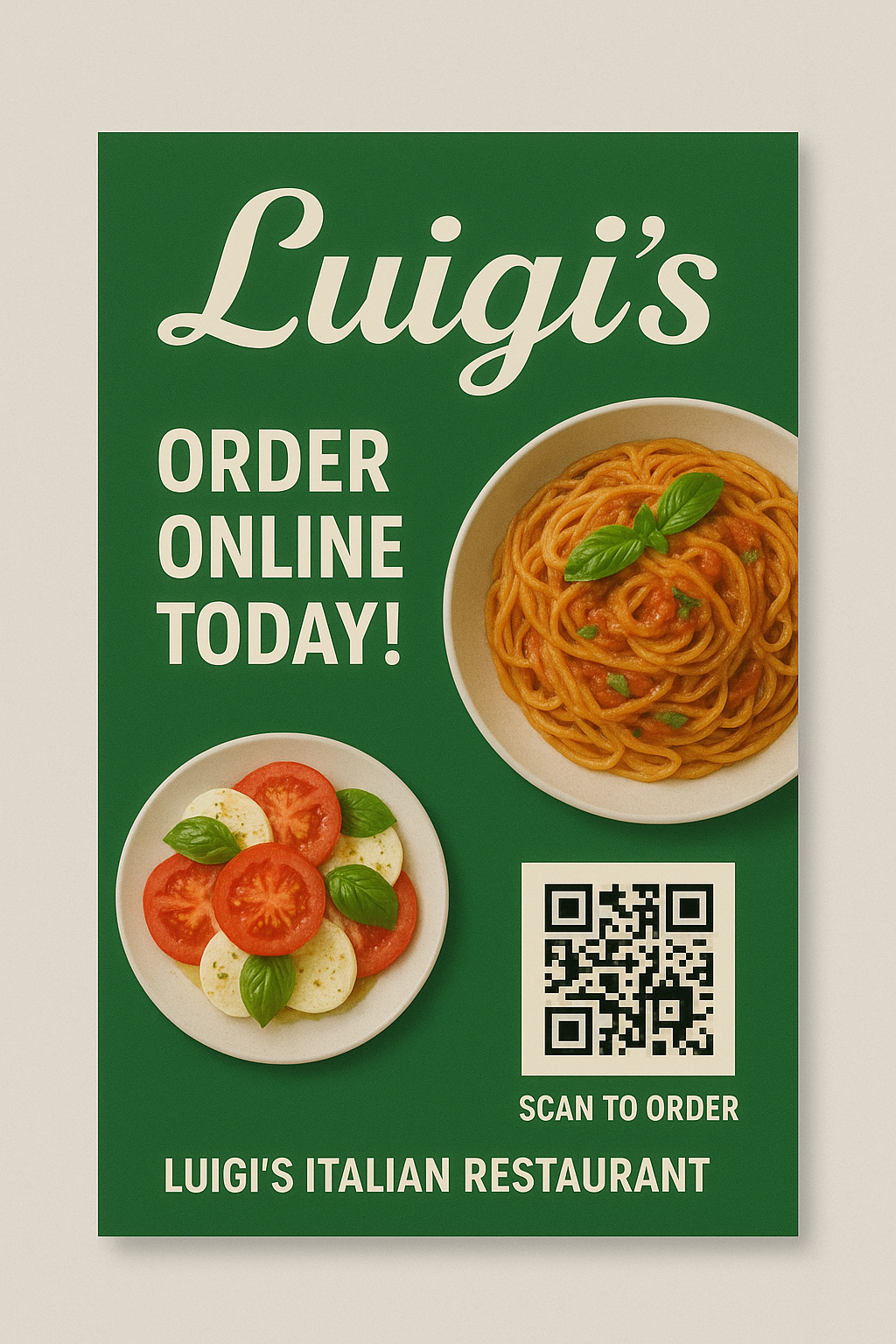
Step 4: Use Bold Colours & Branding
Your flyer should instantly reflect your restaurant’s style.
-
Italian restaurant? Reds, greens, and warm tones.
-
Sushi bar? Minimalist whites and blacks.
-
Street food? Bright, energetic colours.
Stick to 2–3 brand colours for consistency.
Step 5: Add a Clear Headline
This is what people notice first.
Examples:
-
“Authentic Thai Street Food Near You”
-
“50% Off Burgers – This Weekend Only”
-
“Now Delivering to Your Area!”
Make it short, bold, and unmissable.
Step 6: Keep Text Short & Punchy
-
Highlight only the most important details:
-
What you’re offering
-
Where you’re located
-
How to order (phone, website, QR code)
-
-
Use bullet points instead of long sentences.
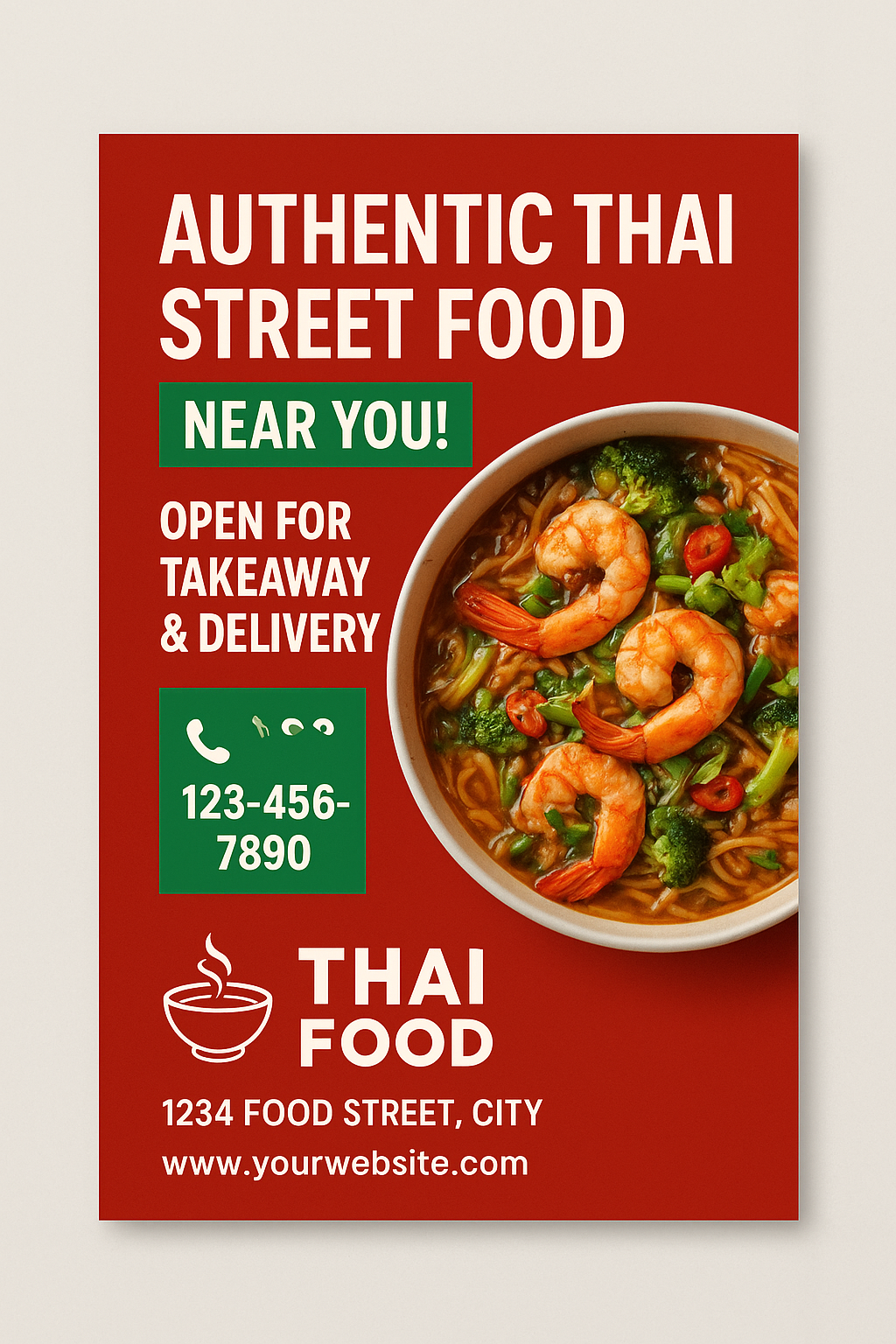
Step 7: Add a Strong Call-to-Action (CTA)
Tell readers exactly what to do next:
-
“Call now to book a table”
-
“Order online at [YourWebsite.com]”
-
“Show this flyer for 10% off”
Make your CTA stand out in a contrasting colour.
Step 8: Include Contact Details
Always add:
-
Restaurant name & logo
-
Address (with map pin if local)
-
Phone number
-
Website/ordering app
-
Social media icons
Step 9: Use Professional Printing
A great design deserves quality print. Choose:
-
Gloss or silk finish for vibrant food photos
-
Recycled or eco stock if sustainability matters
-
A5 flyers with next-day despatch for fast campaigns
Step 10: Plan Distribution
Options include:
-
Handing flyers out at busy spots (stations, shopping areas)
-
Including with takeaway orders
-
Door-to-door delivery with Royal Mail Door to Door
Example Flyer Mock-Ups
Here are some quick mock-ups to illustrate these steps (not final designs, but concepts to inspire you):
-
Hero Image Focus – flyer with one large, appetising photo of a dish.
-
Bold Offer Headline – “2 for 1 Pizza Every Tuesday!” across the top.
-
Clean Layout – clear sections: headline, image, offer, CTA, contact details.
? Pro Tip: Always print a small batch first to test response before rolling out thousands of copies.